Unfortunately the saying “Build it and they will come” is only true of carving baseball diamonds into corn fields. In the case of modern-day marketing, the French proverb “Rome wasn’t built in a day” is far more applicable. With ever changing Google Algorithm updates and rapidly evolving website design, it can be challenging to keep ahead of the digital curve, but here are three easy fixes for bringing your website into the limelight to attract more online enquiries:
1. Page speed
When 47% of consumers expect a web page to load in 2 seconds or less, and 1-second delay in load times can result in a 7% reduction in conversions, your website cannot afford to take its sweet load time.
Not only will 44% of customers penalise you by telling their friends of their bad online shopping experience, but Google also detests slow load times, using site speed in web search ranking. This means if your site loads slowly (and Google’s bots can tell!), you’re likely to be pushed further back in the organic search results behind competitors with faster load times.
There are a variety of factors affecting load times, but one resounding problem is unoptimised images. As Zoompf explains, an unoptimised image is an image that can be reduced in size without affecting the visual experience for your user, also referred to as “lossless” optimisation.
There are two ways to optimise your images: manually resizing (ain’t nobody got time for that), and using a WordPress plugin that will automatically do it for you, like WP Smush Pro. This clever plugin uses advanced compression techniques to ensure the images you’re adding to your shop, blog and other pages of your website don’t slow down page load times.

Check your website speed
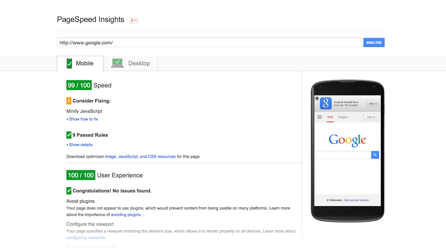
To check your website’s load time, use Google’s PageSpeed tool. This free tool identifies load speed problems and suggests ways to correct speed issues to make your site faster and more mobile-friendly. Simply enter your URL here and let Google analyse your website to reveal a score out of 100 for speed and user experience on both mobile and desktop devices, along with issues you should fix, things to consider fixing, and the areas you’ve scored a pass.
2. Mobile responsiveness
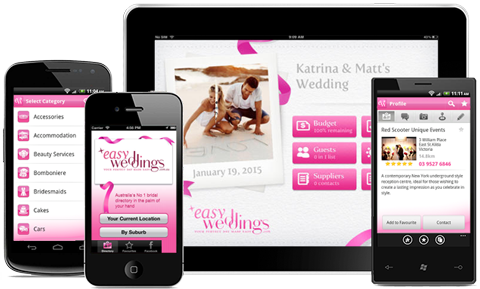
65% of brides now browse websites using a mobile device. That’s not a percentage of your target market you want to upset by presenting them with an unresponsive website that doesn’t automatically scale to the device they’re using.
In 2015, Google began using mobile-friendliness as a ranking criteria for mobile searches. In May of 2016, Google rolls out an update to this ranking signal, which will place even greater emphasis on mobile-friendliness to help brides discover more pages that are both relevant to their wedding planning and mobile-friendly.
Take the test
Even though search query (the phrases and questions people type into the search bar) is still of great importance in the ranking of results (meaning a non-mobile-friendly page with excellent content could still rank well), it’s not a risk worth taking. If you’re unsure if your website is mobile responsive, use Google’s mobile-friendly test tool to find out. If your website fails the test, you’ll be presented with a bunch of resources to get your site mobile in no time.
3. It’s too hard to browse, buy or enquire
User experience can significantly affect conversion; use of fancy and ambiguous icons, high-speed sliders that are too fast to read, and hard to find contact details can influence the time visitors spend on your website, their desire to enquire and ultimately their decision to buy.
Contact forms should strike a delicate balance between gathering enough information for you to prepare a proposal or respond to an enquiry with sufficient information, while providing the lowest barrier to enquiry possible, making it fast and easy for prospects to get in touch.
Form fields NAME, PHONE, EMAIL, WEDDING DATE and MESSAGE should be enough for most wedding vendor contact forms.
The Honeycomb audit
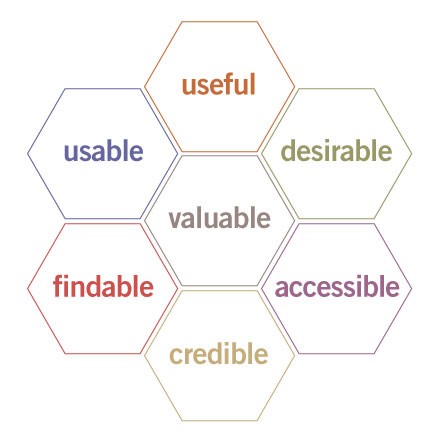
Peter Morville of Semantic Studios developed a user experience honeycomb to help his clients understand why usability is just part of a prospect’s overall website experience:
- Useful: is your product, service and website useful to brides and grooms?
- Usable: if people don’t know what action they should take next or where and how to request more information, you’ve lost a customer.
- Desirable: a balance between efficiency and the power of image, brand, identity and other emotional design elements must be reached. If it’s pretty but dysfunctional, it’s pointless; if it’s functional but ugly, it’s pointless.
- Findable: information should be logical and easy to find. If your customers expect the Contact Us page to be the last tab on the right, then this is where they should find it.
- Accessible: just as buildings have elevators and ramps, it will one day be the expectation that websites are accessible to customers with disabilities (more than 10% of the population)… Something to consider and an opportunity for a great value proposition!
- Credible: design elements can influence users’ trust and whether they believe what a website tells them. Staff bios, prices and testimonials are just some of the many credibility factors you can use to increase enquiries.
- Valuable: sites must deliver value to sponsors and partners, while contributing to the bottom line and improving customer satisfaction.
It’s a big list and a lot to think about, but if you can’t improve every aspect of your website to increase your sales and enquiries due to lack of time or money, try focusing on a single-facet makeover each month or quarter.
If you need a new website, we can help. We’ve built and designed hundreds of websites specifically for wedding businesses. Call us on 0800 334 5554 or email service@easyweddings.co.uk.
What’s the biggest challenge your business faces when it comes to generating leads, enquiries and sales? If we haven’t already covered it, leave a link to your site in the comments and let us know so we can take a look!


